 |
МУНИЦИПАЛЬНОЕ БЮДЖЕТНОЕ
|


Сообщение. Пилотный проект. Данная форма не предназначена для приема обращений граждан в порядке Федерального закона от 02.05.2006 № 59-ФЗ «О порядке рассмотрения обращений граждан Российской Федерации» и предоставляет возможность направить электронное сообщение в рамках реализации пилотного проекта по внедрению «Единого окна цифровой обратной связи». Ответ на сообщение будет направлен не позднее 8 рабочих дней после дня его регистрации, а по отдельным тематикам – в укороченные сроки.
Дорогие друзья!
Я рада приветствовать вас на сайте муниципального бюджетного общеобразовательного учреждения «Средняя общеобразовательная школа №19 имени Героя Советского Союза М.К.Нехаева».
Каждое поколение создает историю и оставляет в ней неизгладимый след.
Нам выпала судьба жить во время больших перемен, когда определяющими стали образованность, интеллект, творчество и талант. Мы верим, что любовь к родному краю, глубокое уважение к достижениям предыдущих поколений, творческий труд, также ценны для вас, потому что именно эти качества сделают вашу жизнь яркой и интересной, дадут стимул к развитию и движению вперед во славу родного города Сергиева Посада и России.

«Билет в будущее» запускает первый бесплатный профориентационный курс для родителей.
«Родители в теме» — это ценная информация для мам и пап, которые озабочены будущим своих детей, которые действительно хотят помочь им найти свой про-фессиональный путь и поддержать их в этом нелегком выборе. Курс доступен на сайте проекта bvbinfo.ru и содержит в себе 5 модулей, полностью раскрывающих важность профориентации и помогающих родителям погрузиться в эту тему максимально доступно.
Эксперты курса расскажут также и о том, как корректно поговорить с ребенком о будущем и как познакомить их с многообразием существующих сегодня профес-сий.
Приглашаем всех родителей школьников на курс «Родители в теме», где у вас будет:
— 8 экспертов в области профориентации;
— 5 разнообразных модулей в формате видеоуроков;
— чек-листы, памятки и планировщики
— и ни единого шанса упустить будущее своего ребенка.

Консультационный пункт
Уважаемые родители!
Сообщаем, что в рамках федерального проекта «Современная школа» национального проекта «Образование» на базе Муниципального бюджетного общеобразовательного учреждения «Средняя общеобразовательная школа №19 имени Героя Советского Союза М.К.Нехаева» вы можете получить бесплатную психолого-педагогическую, методическую и консультационную помощь в удобной для вас форме: очно или дистанционно.
Пожалуйста, заполните заявку на консультирование и ожидайте звонка специалиста. Мы рады вам помочь!

Внимание
Правила безопасного поведения на железнодорожном транспорте.
Нажми на картинку, чтобы узнать подробнее об этих правилах.
События
Hide Divs, Content, and Modules
- Подробности
- Создано 12.05.2013 03:36
Hide Sections of the Template via the Template Configuration
This is the simplest way to hide an area of the template is to use the template interface to easily select areas of the template that you want to hide on tablet sized screens (970px and less) or mobile screens (580px or less). Simply select the area that you want to hide and the Vertex framework takes care of the rest! These fields do work independent of each other, so if you want to hide something on both tablet and mobile sized screens you must select the same area on both fields.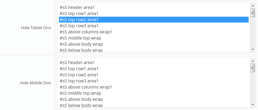
IMPORTANT - If you turn off a column position such as right or right_inset something else must be in the same column or the layout will not work. For example you can turn off right_inset and keep right, but you cannot turn off both unless something is publihsed to right_top or right_bottom as well.
Hide Specific Modules via the Hide Classes
If you have only a specific module that you would like to hide at certain screen sizes, and not an entire section of the template, this is the best approach. A hide class is a class that can be applied to any element on the page and hides that particular element at certain screen sizes. Classes range in 100px increments for large screens and 50px increments for small screens. Below are some examples, and at the very bottom of this page there is a list of all the available hide classes. Use these sparingly if you can. As a recommendation, the primary target of these classes should focus on tablet and mobile sized screens. Wide screen monitors vary in size so it's much harder to use these classes correctly for large monitors. Tablet and mobile devices are much more consistent in size so it is much easier to apply the smaller hide classes.For example, say you want to hide a specific module when the screen sizes reaches 900px wide, and remain hidden for any screen below 900px. Simply add class=hide_900 to the title of the module like this:
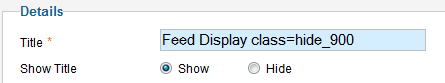
The class is simply put into the title of the module. There must be a space just before class= , and don't worry, the class area of the title won't actually show on the live site, it's only shown in the backend. It must be entered exactly as shown above. The title can be published or unpublished, it does not matter which. Simply adding the classes to the title will apply the classes to the entire module.
What if you want it to hide the module only for a certain range? That's easy just add _only to the end of the class name. hide_900_only will only hide that element from 900px to the next increment in the hide classes, which is 850px. So it will only be hidden from 850px to 900px. You can also add multiple classes to the title like this class=hide_900_only hide_850_only which will apply both classes to the module.
What if you want to hide the module and then show it again later? That's simple, use show_ in the class instead of hide_. This will make the module show for the specified size no matter what other settings are on the module. So if you want to hide the module from 1000px and below, but you want to show it again later then do something like the following class=hide_1000 show_600. This will hide the module from 600px to 1000px.
Is there a more simple way? Yes, of course, the above directions are for experienced users who want to tweak their content for every available screen size. If you don't want to mess around with specific window sizes simply use the following classes instead, which have preset screen sizes applied to them:
hide_all
hide_wide_screen
hide_standard_screen
hide_large_tablet
hide_small_tablet
hide_mobile
show_wide_screen
show_standard_screen
show_large_tablet
show_small_tablet
show_mobile
Why would someone use hide_all? This is a great tool for anyone wanting to show content only on a mobile or tablet sized screen but hide it on all other devices. To do this you should use class="hide_all show_mobile". The hide_all will set the content or module to display:none on all devices, and one the screen size reaches mobile size the show_mobile will override the display:none and show the content.
Hide Specific Content via the Hide Classes
If you have only specific content or images within an article or module that you want to hide then use the same hide classes described above, but wrap that specific content inside of the class instead of applying it to the entire module. For example, in the image below, the third paragraph will hide at 900px and then show again at 700px.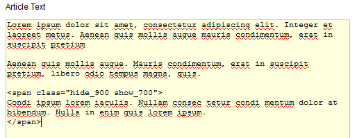
Available Hide Classes
All the available hide classes are listed below. Note there is a break at 970px and 580px to accommodate tablet and mobile sized screens. At the bottom of the list you will see inline calls, these calls should only be used if the default block calls cause a layout problem with your content, which can happen with applying a display:block./* HIDE CLASSES
----------------------------------------------------------- */
@media screen and (max-width: 1600px){
.hide_1600 {
display:none !important;
}
}
@media screen and (min-width:1500px) and (max-width: 1600px){
.hide_1600_only {
display:none !important;
}
}
@media screen and (max-width: 1550px){
.hide_1550 {
display:none !important;
}
}
@media screen and (min-width:1450px) and (max-width: 1550px){
.hide_1550_only {
display:none !important;
}
}
@media screen and (max-width: 1500px){
.hide_1500 {
display:none !important;
}
}
@media screen and (min-width:1400px) and (max-width: 1500px){
.hide_1500_only {
display:none !important;
}
}
@media screen and (max-width: 1450px){
.hide_1450 {
display:none !important;
}
}
@media screen and (min-width:1350px) and (max-width: 1450px){
.hide_1450_only {
display:none !important;
}
}
@media screen and (max-width: 1400px){
.hide_1400 {
display:none !important;
}
}
@media screen and (min-width:1300px) and (max-width: 1400px){
.hide_1400_only {
display:none !important;
}
}
@media screen and (max-width: 1350px){
.hide_1350 {
display:none !important;
}
}
@media screen and (min-width:1250px) and (max-width: 1350px){
.hide_1350_only {
display:none !important;
}
}
@media screen and (max-width: 1300px){
.hide_1300 {
display:none !important;
}
}
@media screen and (min-width:1200px) and (max-width: 1300px){
.hide_1300_only {
display:none !important;
}
}
@media screen and (max-width: 1250px){
.hide_1250 {
display:none !important;
}
}
@media screen and (min-width:1150px) and (max-width: 1250px){
.hide_1250_only {
display:none !important;
}
}
@media screen and (max-width: 1200px){
.hide_1200 {
display:none !important;
}
}
@media screen and (min-width:1100px) and (max-width: 1200px){
.hide_1200_only {
display:none !important;
}
}
@media screen and (max-width: 1150px){
.hide_1150 {
display:none !important;
}
}
@media screen and (min-width:1050px) and (max-width: 1150px){
.hide_1150_only {
display:none !important;
}
}
@media screen and (max-width: 1100px){
.hide_1100 {
display:none !important;
}
}
@media screen and (min-width:1000px) and (max-width: 1100px){
.hide_1100_only {
display:none !important;
}
}
@media screen and (max-width: 1050px){
.hide_1050 {
display:none !important;
}
}
@media screen and (min-width:950px) and (max-width: 1050px){
.hide_1050_only {
display:none !important;
}
}
@media screen and (max-width: 1000px){
.hide_1000 {
display:none !important;
}
}
@media screen and (min-width:900px) and (max-width: 1000px){
.hide_1000_only {
display:none !important;
}
}
@media screen and (max-width: 970px){
.hide_970 {
display:none !important;
}
}
@media screen and (min-width:900px) and (max-width: 970px){
.hide_970_only {
display:none !important;
}
}
@media screen and (max-width: 950px){
.hide_950 {
display:none !important;
}
}
@media screen and (min-width:900px) and (max-width: 950px){
.hide_950_only {
display:none !important;
}
}
@media screen and (max-width: 900px){
.hide_900 {
display:none !important;
}
}
@media screen and (min-width:850px) and (max-width: 900px){
.hide_900_only {
display:none !important;
}
}
@media screen and (max-width: 850px){
.hide_850 {
display:none !important;
}
}
@media screen and (min-width:800px) and (max-width: 850px){
.hide_850_only {
display:none !important;
}
}
@media screen and (max-width: 800px){
.hide_800 {
display:none !important;
}
}
@media screen and (min-width:750px) and (max-width: 800px){
.hide_800_only {
display:none !important;
}
}
@media screen and (max-width: 750px){
.hide_750 {
display:none !important;
}
}
@media screen and (min-width:700px) and (max-width: 750px){
.hide_750_only {
display:none !important;
}
}
@media screen and (max-width: 700px){
.hide_700 {
display:none !important;
}
}
@media screen and (min-width:650px) and (max-width: 700px){
.hide_700_only {
display:none !important;
}
}
@media screen and (max-width: 650px){
.hide_650 {
display:none !important;
}
}
@media screen and (min-width:600px) and (max-width: 650px){
.hide_650_only {
display:none !important;
}
}
@media screen and (max-width: 600px){
.hide_600 {
display:none !important;
}
}
@media screen and (min-width:580px) and (max-width: 600px){
.hide_600_only {
display:none !important;
}
}
@media screen and (max-width: 579px){
.hide_580 {
display:none !important;
}
}
@media screen and (min-width:550px) and (max-width: 579px){
.hide_580_only {
display:none !important;
}
}
.hide_all {
display:none ! important;
}
@media screen and (min-width:1300px) and (max-width: 50000px){
.hide_wide_screen {
display:none !important;
}
}
@media screen and (min-width:971px) and (max-width: 1299px){
.hide_standard_screen {
display:none !important;
}
}
@media screen and (min-width:750px) and (max-width: 970px){
.hide_large_tablet {
display:none !important;
}
}
@media screen and (min-width:580px) and (max-width: 750px){
.hide_small_tablet {
display:none !important;
}
}
@media screen and (min-width:580px) and (max-width: 750px){
.hide_small_tablet {
display:none !important;
}
}
@media screen and (max-width: 579px){
.hide_mobile {
display:none !important;
}
}
@media screen and (max-width: 1600px){
.show_1600 {
display:block !important;
}
}
@media screen and (min-width:1500px) and (max-width: 1600px){
.show_1600_only {
display:block !important;
}
}
@media screen and (max-width: 1550px){
.show_1550 {
display:block !important;
}
}
@media screen and (min-width:1450px) and (max-width: 1550px){
.show_1550_only {
display:block !important;
}
}
@media screen and (max-width: 1500px){
.show_1500 {
display:block !important;
}
}
@media screen and (min-width:1400px) and (max-width: 1500px){
.show_1500_only {
display:block !important;
}
}
@media screen and (max-width: 1450px){
.show_1450 {
display:block !important;
}
}
@media screen and (min-width:1350px) and (max-width: 1450px){
.show_1450_only {
display:block !important;
}
}
@media screen and (max-width: 1400px){
.show_1400 {
display:block !important;
}
}
@media screen and (min-width:1300px) and (max-width: 1400px){
.show_1400_only {
display:block !important;
}
}
@media screen and (max-width: 1350px){
.show_1350 {
display:block !important;
}
}
@media screen and (min-width:1250px) and (max-width: 1350px){
.show_1350_only {
display:block !important;
}
}
@media screen and (max-width: 1300px){
.show_1300 {
display:block !important;
}
}
@media screen and (min-width:1200px) and (max-width: 1300px){
.show_1300_only {
display:block !important;
}
}
@media screen and (max-width: 1250px){
.show_1250 {
display:block !important;
}
}
@media screen and (min-width:1150px) and (max-width: 1250px){
.show_1250_only {
display:block !important;
}
}
@media screen and (max-width: 1200px){
.show_1200 {
display:block !important;
}
}
@media screen and (min-width:1100px) and (max-width: 1200px){
.show_1200_only {
display:block !important;
}
}
@media screen and (max-width: 1150px){
.show_1150 {
display:block !important;
}
}
@media screen and (min-width:1050px) and (max-width: 1150px){
.show_1150_only {
display:block !important;
}
}
@media screen and (max-width: 1100px){
.show_1100 {
display:block !important;
}
}
@media screen and (min-width:1000px) and (max-width: 1100px){
.show_1100_only {
display:block !important;
}
}
@media screen and (max-width: 1050px){
.show_1050 {
display:block !important;
}
}
@media screen and (min-width:950px) and (max-width: 1050px){
.show_1050_only {
display:block !important;
}
}
@media screen and (max-width: 1000px){
.show_1000 {
display:block !important;
}
}
@media screen and (min-width:900px) and (max-width: 1000px){
.show_1000_only {
display:block !important;
}
}
@media screen and (max-width: 970px){
.show_970 {
display:block !important;
}
}
@media screen and (min-width:900px) and (max-width: 970px){
.show_970_only {
display:block !important;
}
}
@media screen and (max-width: 950px){
.show_950 {
display:block !important;
}
}
@media screen and (min-width:900px) and (max-width: 950px){
.show_950_only {
display:block !important;
}
}
@media screen and (max-width: 900px){
.show_900 {
display:block !important;
}
}
@media screen and (min-width:850px) and (max-width: 900px){
.show_900_only {
display:block !important;
}
}
@media screen and (max-width: 850px){
.show_850 {
display:block !important;
}
}
@media screen and (min-width:800px) and (max-width: 850px){
.show_850_only {
display:block !important;
}
}
@media screen and (max-width: 800px){
.show_800 {
display:block !important;
}
}
@media screen and (min-width:750px) and (max-width: 800px){
.show_800_only {
display:block !important;
}
}
@media screen and (max-width: 750px){
.show_750 {
display:block !important;
}
}
@media screen and (min-width:700px) and (max-width: 750px){
.show_750_only {
display:block !important;
}
}
@media screen and (max-width: 700px){
.show_700 {
display:block !important;
}
}
@media screen and (min-width:650px) and (max-width: 700px){
.show_700_only {
display:block !important;
}
}
@media screen and (max-width: 650px){
.show_650 {
display:block !important;
}
}
@media screen and (min-width:600px) and (max-width: 650px){
.show_650_only {
display:block !important;
}
}
@media screen and (max-width: 600px){
.show_600 {
display:block !important;
}
}
@media screen and (min-width:580px) and (max-width: 600px){
.show_600_only {
display:block !important;
}
}
@media screen and (max-width: 579px){
.show_580 {
display:block !important;
}
}
@media screen and (min-width:550px) and (max-width: 579px){
.show_580_only {
display:block !important;
}
}
@media screen and (min-width:1300px) and (max-width: 50000px){
.show_wide_screen {
display:block !important;
}
}
@media screen and (min-width:971px) and (max-width: 1299px){
.show_standard_screen {
display:block !important;
}
}
@media screen and (min-width:750px) and (max-width: 970px){
.show_large_tablet {
display:block !important;
}
}
@media screen and (min-width:580px) and (max-width: 750px){
.show_small_tablet {
display:block !important;
}
}
@media screen and (max-width: 579px){
.show_mobile {
display:block !important;
}
}
/* THE INLINE SHOW CALLS BELOW SHOULD BE USED SELDOMLY. THEY SHOULD ONLY BE USED
IF THE BLOCK SHOW CALLS ABOVE CAUSE A LAYOUT ISSUE WHEN TRIGGERED.
----------------------------------------------------------- */
@media screen and (max-width: 1600px){
.show_1600_inline {
display:inline !important;
}
}
@media screen and (min-width:1500px) and (max-width: 1600px){
.show_1600_only_inline {
display:inline !important;
}
}
@media screen and (max-width: 1550px){
.show_1550_inline {
display:inline !important;
}
}
@media screen and (min-width:1450px) and (max-width: 1550px){
.show_1550_only_inline {
display:inline !important;
}
}
@media screen and (max-width: 1500px){
.show_1500_inline {
display:inline !important;
}
}
@media screen and (min-width:1400px) and (max-width: 1500px){
.show_1500_only_inline {
display:inline !important;
}
}
@media screen and (max-width: 1450px){
.show_1450_inline {
display:inline !important;
}
}
@media screen and (min-width:1350px) and (max-width: 1450px){
.show_1450_only_inline {
display:inline !important;
}
}
@media screen and (max-width: 1400px){
.show_1400_inline {
display:inline !important;
}
}
@media screen and (min-width:1300px) and (max-width: 1400px){
.show_1400_only_inline {
display:inline !important;
}
}
@media screen and (max-width: 1350px){
.show_1350_inline {
display:inline !important;
}
}
@media screen and (min-width:1250px) and (max-width: 1350px){
.show_1350_only_inline {
display:inline !important;
}
}
@media screen and (max-width: 1300px){
.show_1300_inline {
display:inline !important;
}
}
@media screen and (min-width:1200px) and (max-width: 1300px){
.show_1300_only_inline {
display:inline !important;
}
}
@media screen and (max-width: 1250px){
.show_1250_inline {
display:inline !important;
}
}
@media screen and (min-width:1150px) and (max-width: 1250px){
.show_1250_only_inline {
display:inline !important;
}
}
@media screen and (max-width: 1200px){
.show_1200_inline {
display:inline !important;
}
}
@media screen and (min-width:1100px) and (max-width: 1200px){
.show_1200_only_inline {
display:inline !important;
}
}
@media screen and (max-width: 1150px){
.show_1150_inline {
display:inline !important;
}
}
@media screen and (min-width:1050px) and (max-width: 1150px){
.show_1150_only_inline {
display:inline !important;
}
}
@media screen and (max-width: 1100px){
.show_1100_inline {
display:inline !important;
}
}
@media screen and (min-width:1000px) and (max-width: 1100px){
.show_1100_only_inline {
display:inline !important;
}
}
@media screen and (max-width: 1050px){
.show_1050_inline {
display:inline !important;
}
}
@media screen and (min-width:950px) and (max-width: 1050px){
.show_1050_only_inline {
display:inline !important;
}
}
@media screen and (max-width: 1000px){
.show_1000_inline {
display:inline !important;
}
}
@media screen and (min-width:900px) and (max-width: 1000px){
.show_1000_only_inline {
display:inline !important;
}
}
@media screen and (max-width: 970px){
.show_970_inline {
display:inline !important;
}
}
@media screen and (min-width:900px) and (max-width: 970px){
.show_970_only_inline {
display:inline !important;
}
}
@media screen and (max-width: 950px){
.show_950_inline {
display:inline !important;
}
}
@media screen and (min-width:900px) and (max-width: 950px){
.show_950_only_inline {
display:inline !important;
}
}
@media screen and (max-width: 900px){
.show_900_inline {
display:inline !important;
}
}
@media screen and (min-width:850px) and (max-width: 900px){
.show_900_only_inline {
display:inline !important;
}
}
@media screen and (max-width: 850px){
.show_850_inline {
display:inline !important;
}
}
@media screen and (min-width:800px) and (max-width: 850px){
.show_850_only_inline {
display:inline !important;
}
}
@media screen and (max-width: 800px){
.show_800_inline {
display:inline !important;
}
}
@media screen and (min-width:750px) and (max-width: 800px){
.show_800_only_inline {
display:inline !important;
}
}
@media screen and (max-width: 750px){
.show_750_inline {
display:inline !important;
}
}
@media screen and (min-width:700px) and (max-width: 750px){
.show_750_only_inline {
display:inline !important;
}
}
@media screen and (max-width: 700px){
.show_700_inline {
display:inline !important;
}
}
@media screen and (min-width:650px) and (max-width: 700px){
.show_700_only_inline {
display:inline !important;
}
}
@media screen and (max-width: 650px){
.show_650_inline {
display:inline !important;
}
}
@media screen and (min-width:600px) and (max-width: 650px){
.show_650_only_inline {
display:inline !important;
}
}
@media screen and (max-width: 600px){
.show_600_inline {
display:inline !important;
}
}
@media screen and (min-width:580px) and (max-width: 600px){
.show_600_only_inline {
display:inline !important;
}
}
@media screen and (max-width: 579px){
.show_580_inline {
display:inline !important;
}
}
@media screen and (min-width:550px) and (max-width: 579px){
.show_580_only_inline {
display:inline !important;
}
}
@media screen and (min-width:1300px) and (max-width: 50000px){
.show_wide_screen_inline {
display:inline !important;
}
}
@media screen and (min-width:971px) and (max-width: 1299px){
.show_standard_screen_inline {
display:inline !important;
}
}
@media screen and (min-width:750px) and (max-width: 970px){
.show_large_tablet_inline {
display:inline !important;
}
}
@media screen and (min-width:580px) and (max-width: 750px){
.show_small_tablet_inline {
display:inline !important;
}
}
@media screen and (max-width: 579px){
.show_mobile_inline {
display:inline !important;
}
}
Интересно

Полезно


Наше все


Полезные ссылки
Контактная информация
Адрес:
Московская область, г. Сергиев Посад,
ул. Леонида Булавина, д. 6
Контактные телефоны:
• директор школы, секретарь +7 496 542-93-09 (телефон/факс)
• учебная часть +7 496 542- 02-11
• зав. структурного отделения +7 496 542-34-43
• медицинский кабинет +7 496 542-28-85
• пост охраны +7 496 542-45-67
Почта: Этот адрес электронной почты защищен от спам-ботов. У вас должен быть включен JavaScript для просмотра.